Lisburne Road, London NW3

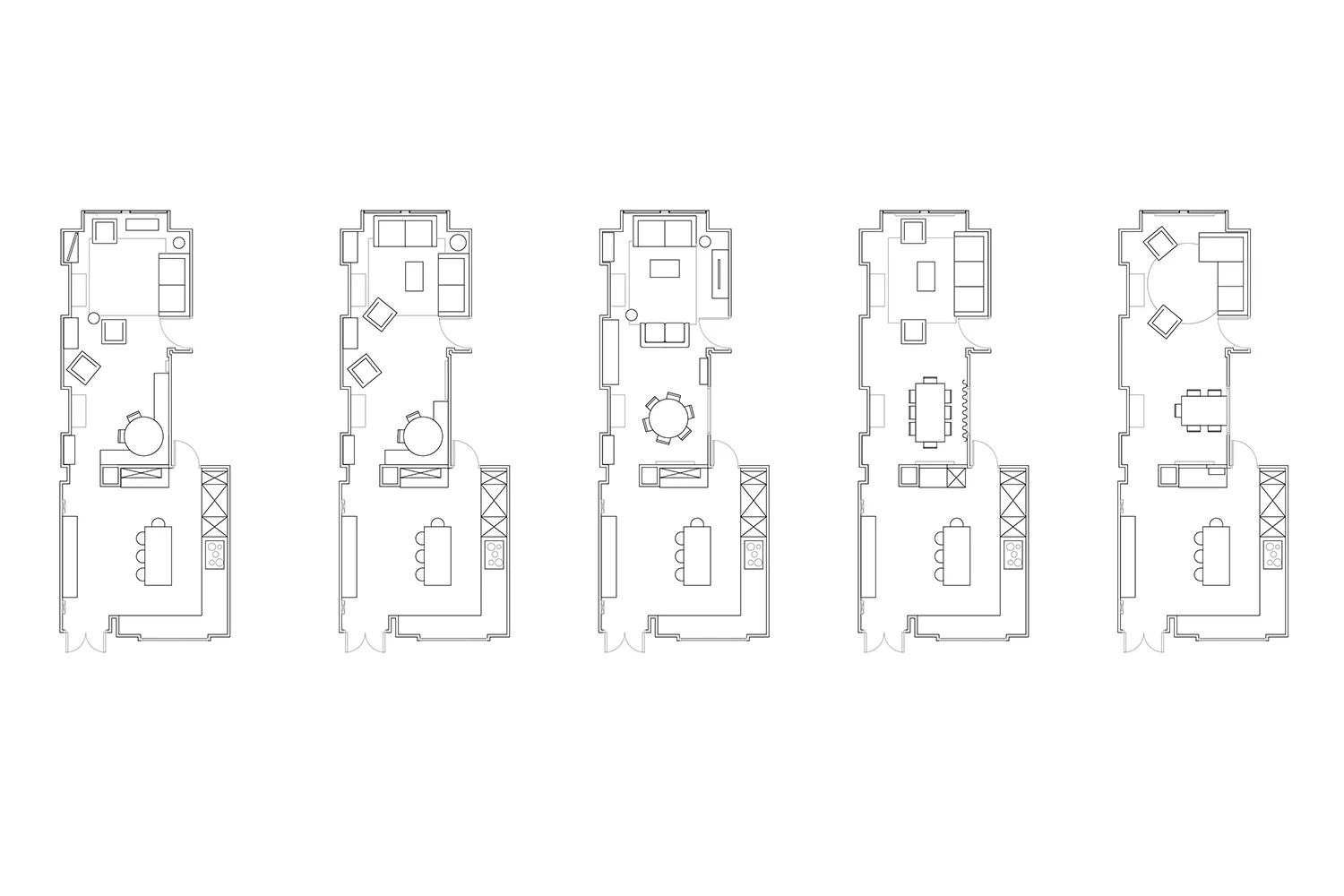
This Victorian terraced house in Hampstead had been had been stripped of most of its original features to the extent that our clients felt it lacked warmth and character, particularly in the open-plan living / dining area.  We worked together on reinstating the original features, choosing a new colour scheme and improving the layout to make the dining space function more efficiently within the open-plan layout.

Open plan living and dining room

This property had been stripped of most of its original features, and our clients were keen to reinstate as many of these as possible – cornice, picture rail and ceiling roses, replace the spot lights with pendant lights and install fireplaces on the bare chimneybreasts. The new deeper paint colour on the walls allows these features to stand out and adds more warmth and character to the space.

Our clients also felt that the open plan dining end of the room was more of a thoroughfare to the kitchen rather than a relaxing space to sit and eat.  We designed a bespoke L-shaped bench with concealed storage as a way to anchor the dining table and maximise the circulation space.  We also removed the glass panel between here and the hallway – this had been a contemporary addition which would no longer suit the space, and had a wall built in it’s place.

We knocked through an ‘arch’ (or ‘hatch’) opening between the dining area and the kitchen. This was a way to bring in more natural light from the kitchen into an otherwise dimly lit ‘middle room’ whilst also making it easier to serve meals and drinks from the kitchen to the dining table.

Hallway

Hallways in Victorian terraced houses can often be quite dark and narrow.  A common challenge is how to lighten them up and carve out storage space for coats. 

In this case, we felt that the front door was too dark and plain in contrast to the intricate cornicing overhead.

However, rather than replacing the door, we created a panelled effect using left over picture rail lengths, painted it white and hung a long mirror on the adjacent wall so as to reflect as much light as possible. 

We hung coat hooks further down the hall as we didn't want to clog up the main entrance.

Kitchen

Our intention was to improve the existing kitchen and address a number of issues with the space. 

The dresser had become a source for clutter which we felt could be better utilised as worktop surface with storage below and an opening to the dining area.  From the onset, we wanted to make the dining area more usable and comfortable and creating a direct link to the kitchen was one way we sought to do this.

The unusually long radiator on the kitchen extension wall made it unusable and seemed like a good opportunity to create extra storage space and a casual seating area which are clients felt was lacking.  We designed a bespoke bench with easy pull out baskets for kids' toys and had 2 vertical radiators fitted on either side.

We had the existing kitchen cupboards repainted, and implemented a warmer colour scheme throughout.

The Design Process


The Implementation Process

Check out this project's before and after pictures here.