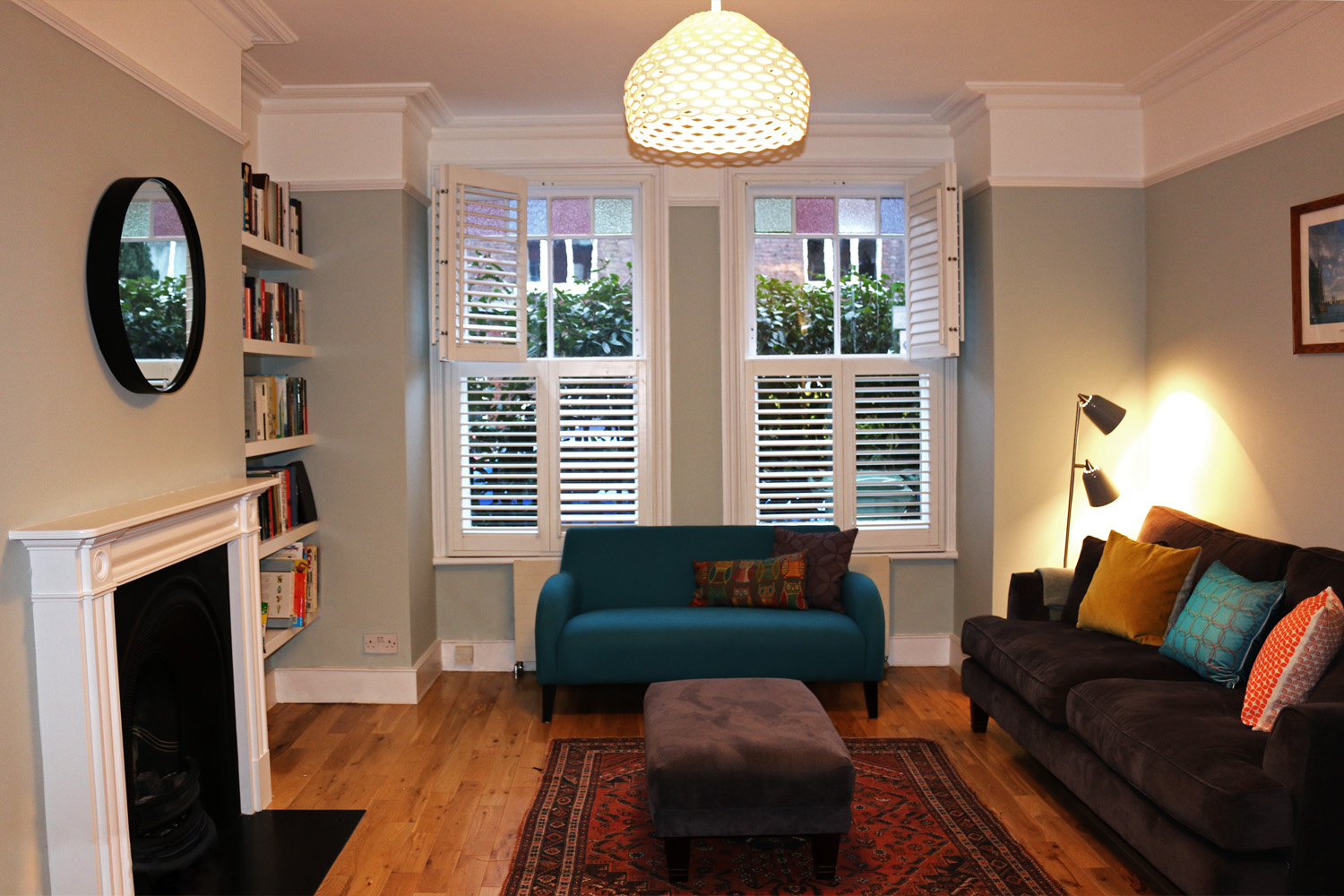
Deirdre and I recorded this episode of The DnA of Home Interiors in my house (before Covid-19 restrictions). A two-story Victorian end of terrace house in Holloway.
A huge percentage of my interior design project work over the years has been in Victorian, Edwardian and around London, and some Georgian. It’s a subject that I am very passionate about. Not only that, but I have lived in period homes in London since 2002, including conversion flats, which I have thoroughly enjoyed. (And it also means I have experienced the draughty windows, high ceiling decorating challenges etc first hand, as well as the benefits!)
You can listen here, or read our notes below.
Before we begin, just a quick summary of the periods in which these types of homes were built:
Georgian: 1714 - 1837
Image from Rightmove (House on Thornill Rd, London N1)
Victorian: 1837 - 1901
Image from Rightmove (House on Lady Margaret Rd, London NW5)
Edwardian: 1901 - 1914
Image from Rightmove (House on Midhurst Rd, London N10)
Mixing Styles
Deirdre and I discuss how to go about mixing styles in your period home, when it comes to furniture and accessories too. It may be a very traditional building in feel or it may have been modernised inside and we chat thought some approaches and ideas for both circumstances.
Main features inside a period home
Bay windows, ornate fireplaces, cornicing, ceiling roses, picture rails, dado rails (originally installed to protect walls from the backs of chairs) are some of the features you may or may not have in your period home.
Picture rails
Deirdre wanted to know more about picture rails - what height would they typically be from the ceiling? About 30cm or more, depending on the height of the ceiling. They were originally used for hanging pictures, using picture hooks with wire. You can still do this today, here is an illustration of the ways you could go about hanging your frames:
Illustration from UK Picture Framing Supplies
Where should you stop your paint colour if you have a picture rail?
There are lots of approaches you can take and it’s really down to personal preference. You can paint a colour up to the ceiling but have different colour or white on picture rail. Or colour just up to picture rail and have a different colour or white above. Since recording the podcast I’ve also come across a few examples of wallpapering above the picture rail only!
Photo from our Thorpewood Avenue project.
Photo from our Lisburne Road project.
Great to have all these lots of these period features intact - but sometimes these can be a challenge for people when making furnishing decisions, as it can feel like less of a ‘blank canvas’ to start with.
However, these homes can feel very soulless if the period features are stripped out.
Finished photo from our Lisburne Road project with cornice, ceiling roses, picture rails and fireplaces were re-instated in the double reception room
The ‘before’ photos show the lack of period features - see more before & after photos here
If you would like an eclectic look and feel to your period home
By this we mean of contemporary styles, mix of prints, patterns, colours. I talk about how I approach the sourcing of furniture and accessories to go in the room.
So, as I’ve probably mentioned in some previous episodes, I love to think about opposites.
Opposites attract
If the room has ornate period features, then start by bringing in something sleek and a little more minimal in style - this could be a sofa for example in a living room, simple in shape perhaps on thin legs.
Then, keeping with the living room example, perhaps you would like a feature chair in the corner, a rug and some lighting - for these go ‘middle ground’ - styles which are not as decorative as, say, the cornice & fireplace but not as minimal as the sleek sofa. By filling those gaps in the middle of your two extremes with different styles, you can also bring in more pattern, more colours and more texture.
Focal points in the room
You might naturally have a focal point in place, for example a fireplace. But if this has been removed, you may need to think about creating a focal point, especially in a large room with high ceilings.
Sometimes it’s best to recreate focal points in a new way in a room. Start by thinking about where the focal point would have been. You don’t have to re-instate a victorian fireplace in a living room for example if that’s too traditional an idea for you, or perhaps budget doesn’t permit as you need to buy other items.
If that is the case you could consider ideas such as a large print or a large mirror on the chimneybreast, and your eye will be drawn towards it. Build your room scheme out from there, thinking about the scale, the shape and the colours in your focal point..
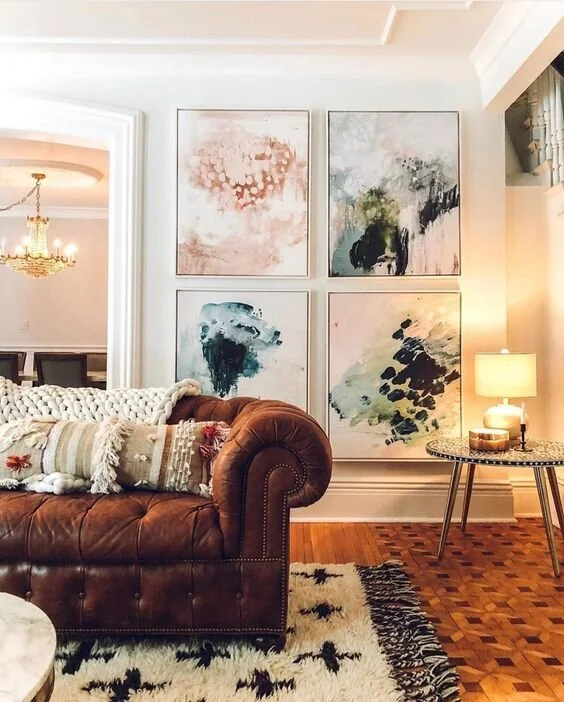
On a chimneybreast think about artwork that comes lower to the ground - Image from Lindsay Letters
In this case perhaps don’t go as minimal for the large furniture items, but choose something a little more decorative, in a way compensating for the atmosphere of the features the room would have originally had.
Re-instating original features
We talk about bespoke cornicing to suit existing and off the shelf options too. Also ceiling roses and researching the history of the property to see what would have been.
Lost definition of original features and painting edges - this can be challenging as the edges are rarely straight… but we’ve got opinions on this too.
Furniture and accessories
Antiques, modern, mid-century styles - we talk about mixing these and what pieces from the past you can incorporate and how. We love the idea of up-cycling and inheriting items which will add variety, warmth and personality to the space. Constantly thinking about the mix of materials, colours, textures and patterns here is key in the planning stage.
Example of a a furniture proposal for a Victorian living room in North London - see full project here.
Example of a William Morris Fabric - Strawberry Thief, image from Style Library
One example I give is the idea of using a traditional pattern used in a modern way, eg a William Morris print. Rather than wallpapering the whole room in this type of pattern (which would give you a very traditional look), use it in an upholstery fabric on a contemporary chair. Then add a rug, with a large scale abstract pattern almost like a piece of modern art on the floor. This can sit very well with the small scale more intricate pattern on the feature chair.
Add a large sofa or two (depending on available space of course) in plain fabrics to counterbalance the small pattern of the chair and the large pattern of rug - then add cushions and throws to bring in more patterns and textures and colours on the sofas.
Opposites: old features + modern additions
Do the same with accessories - Deirdre reminds me about the tradition of display cabinets or dressers in the past - with ornaments / fine china inside. Take the vintage wood idea from this - don’t be seeking perfect condition but embrace the old worn look and interesting texture. Counteract this with some modern sleek features - a glass or marble coffee table, smooth to the touch. Mixing these types of materials and textures can result in a very cosy and interesting space and hopefully also one that you feel reflects you as a person.
Imperfection
The subject of embracing imperfection and things from the past leads us on to the subject of antique mirrors, distressed frames and tinted mirror too.
Deirdre has tinted mirrored splashback in her kitchen - I absolutely love this idea. Deirdre says its her best design decision ever! Another great example of where old and new could sit so well together.
A window pane mirror, image from ufurnish.com
Mirrors great for bringing more light
There is a particular place I love putting a big mirror - when a double reception room has had a wall built where the dividing doors would have been. A mirror on wall opposite window in front reception room (or the rear reception room!) can really enliven the space. This is the wall where there would have been double doors between the two reception rooms, allowing light to be passed through when they were open, but also a focal point on that wall even when they are closed. So often I’ve found people don’t know what do do with that wall. Also the room might be lacking in light. So the mirror adds a focal point and helps reflect some light around. Particularly a mirror that looks like a window frame - there are alot of these available at the moment.
Final thoughts
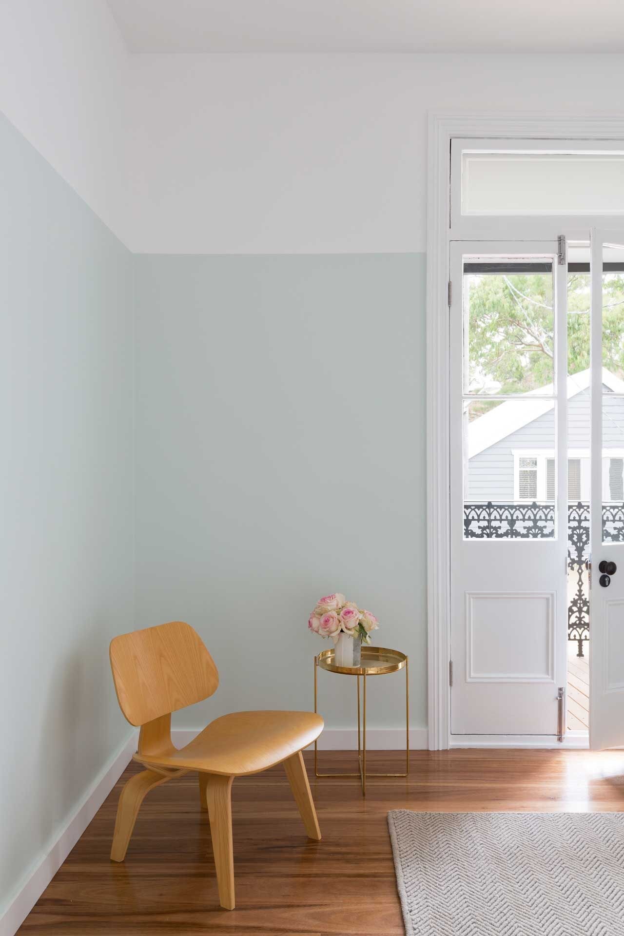
Thinking back on the picture rail and cornice features - if you don’t have these, and don’t want to re-istate them, you could paint the band in a contrasting colour, between the ceiling and where the picture rail would have been. Or paint the main part of the walls up to picture rail height in a different colour. Just like not having a fireplace and putting a large print on the chimneybreast instead, or not having the double doors and putting a window pane mirror there, this is another way to retrieve some of the sense of the proportion and character of what would have been originally. If you need to decorate anyway and you don’t have the budget to re-instate the picture rail, it’s another approach. One that leaves you with a more modern look, as you are not putting the period detail in but you are still recognising that is what would have been.
Photo from Pinterest - source Glenn Kynnersley
Success comes in decorating these types of rooms when you are mindful of the original features. Even if you are replicating that in a very different creative way to how the Victorians or Edwardians would have envisage it, it can really work.
And it’s easier to achieve that straight line as you are not painting up against the original features we were talking about earlier on!
Thank you for reading and listening. We will be back in two weeks time with another guest interview.
Where to find the The DnA of Home Interiors Podcast
If you enjoy the podcast please leave us a review!
Have you got any design decisions you would like help with?
Join our Facebook community and follow us on Instagram - Deirdre and I will be starting some live Q & A sessions soon where you can submit your design dilemmas and get some advice!


