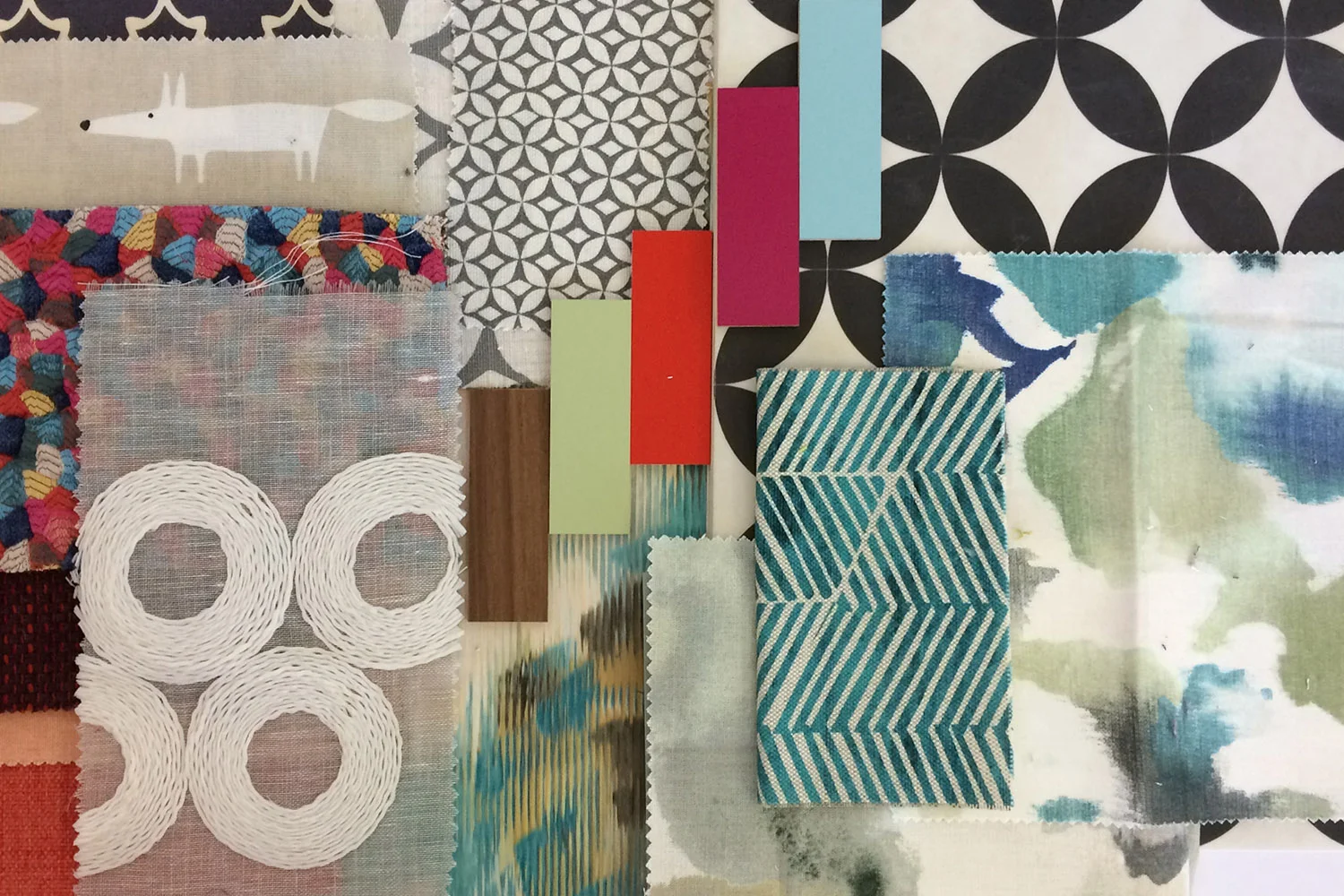
Lately it feels like the world of interior design has seen a renaissance of pattern and print! It’s a great time to be designing your home, with a huge variety of furniture, lighting and accessories in all types of colours, finishes and patterns at your fingertips.
However, we understand that with so much choice, it’s easy to lose confidence and get trapped in a cycle of indecision. So we thought we’d discuss our approach to mixing pattern – share some case studies from previous projects and offer some guidelines.
Charlotte Street Hotel, London
If you find yourself identifying with a more conservative approach to pattern, you may start out by wondering why the use of pattern is even worth considering.
Sometimes, the use of pattern is so masterfully integrated into an interior space that we may take its effect for granted; however, its absence can be undeniably felt in a generic hotel room of plain walls and bed linen.
We were recently at the Charlotte Street Hotel designed by Kit Kemp - where pattern, texture and colour reign supreme. Abstract paintings, meticulous botanical diagrams and playful cushion prints are only a few of the patterns you can spot in the reading room. Patterns, and the way they relate to each other help to define personality and create narrative.
‘Bold’ is subjective
Boy's Bedroom - Hanley Road, London N4
Go as far as you feel comfortable with! If you love pattern in other aspects of your life (fashion, stationary), don’t shy away from it in your home. We loved working on this boy’s bedroom – the mix of geometric bluey-greens on the chimney breast with the grey fox fabric Roman blind creates a space that instantly brings a smile to your face!
Scale it up and down
Living Room - Wilberforce Road, London N4
We’ve used various different patterns in this living room – the black & white curtain fabric pattern is small in comparison to the honeycomb pattern on the rug, and smaller still is the chevron inlay on the side table. The difference in scale and gaps of block colour between them means that none of the patterns are competing with each other.
Embrace change - alternate prints and cushion covers
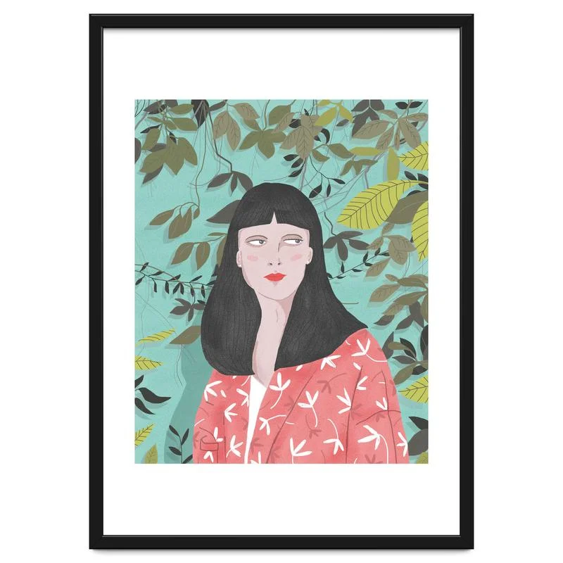
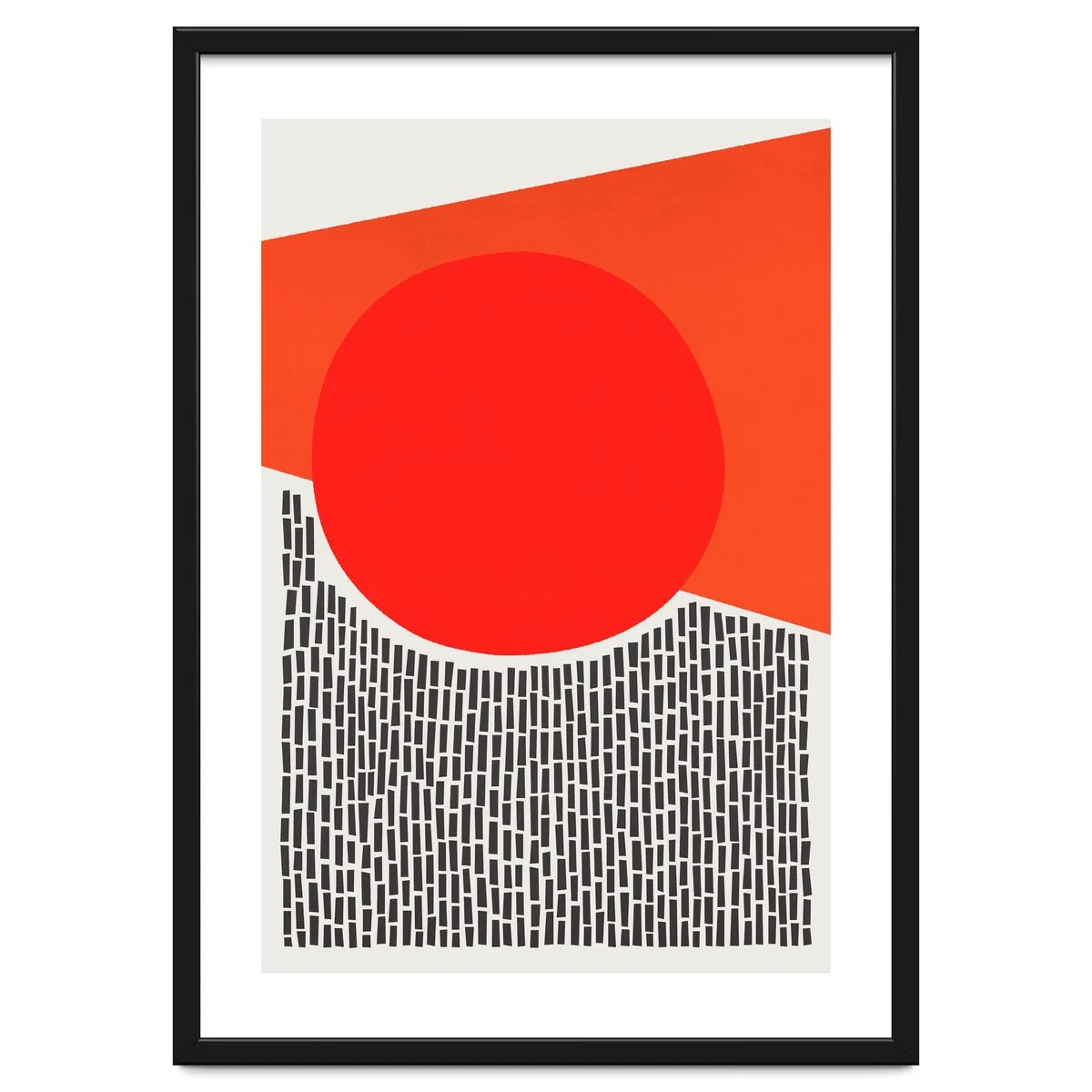
Really drawn to a print or pattern but not sure if it will stand the test of time? Why not bring it in as a print or cushion cover? Stick to a budget and enjoy changing it around every few years if you fancy a new look!
Keep colours tones consistent across different patterns
Study / Guest Room - Brownlow Road, London N11
In this guest room, we wanted to introduce different patterns but maintain an overall calm restful feel. The large scale wallpaper with metallic florals picks up the small scale embossed pattern on the chest of drawers.
Contrast linear patterns with organic shapes
Living Room - Middleway, London NW11
Stripes of different scales on the curtains, rug and cushion contrast the curved, organic pattern on the chair. In this living room, we are also playing with pattern scale, and using it to our advantage to create interesting focal points to attract your attention.


